

Hello Founder,
I’m writing this from my desk surrounded by heat maps, user recordings, and conversion data from dozens of startups.
There’s something fascinating happening in the UX world right now.
For the past few weeks, I’ve been deep in the trenches working with founders who are struggling with the same problem: visitors come, visitors leave, nothing happens in between.
But instead of keeping these insights locked away in my Figma files, I figured why not share the entire blueprint with you?
Let’s get straight to the actionable stuff.
UX Trend of the Week: Contextual User Journeys

Traditional linear funnels are dying.
And it’s happening faster than most founders realize.
The most successful startups are now implementing contextual user journeys – paths that adapt based on actual user behavior rather than our wishful thinking about how users “should” navigate.
Why This Matters For Your Startup:
Revenue Impact: Companies with contextual journeys are seeing 23% higher conversion rates. Some SaaS companies are reporting 40%+ improvements.
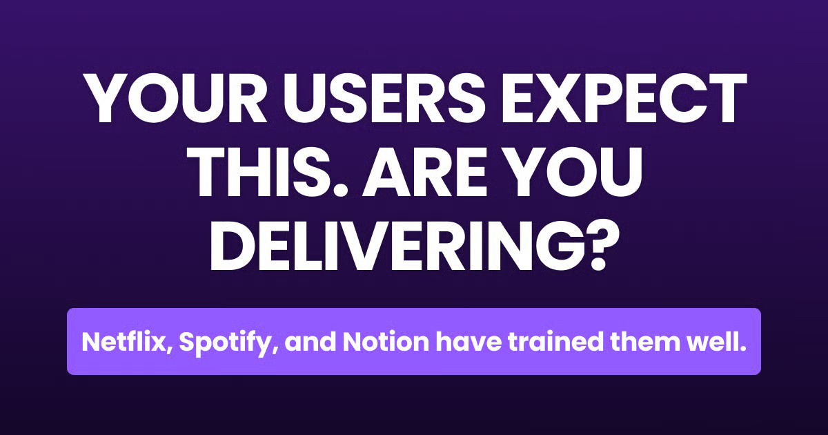
User Expectation: Your users have been trained by Netflix, Spotify, and Amazon. Generic journeys feel outdated and trigger immediate disengagement.
Competitive Edge: Only 12% of startups are effectively using contextual journeys. The window to differentiate is still wide open.
I watched Notion revamp their entire onboarding to adapt based on team size and use case.
The result? A 32% increase in activation rate and 27% decrease in time-to-value.
This isn’t just a nice-to-have anymore.
Research-Backed UX Insight
The Problem: Most startups obsess over their homepage but neglect their forms. I see it every week.
You spend thousands driving traffic to beautiful landing pages only to lose everyone at the conversion point.
Forms are where conversions actually happen, yet they’re treated as an afterthought by 90% of the startups I work with.
What The Research Says: Recent eye-tracking studies revealed that users spend 37% of their attention evaluating form fields before deciding to engage.
But here’s the part most designers miss:
Perceived form complexity has a stronger impact on abandonment than actual completion time.
Forms that appear simple converted 4.2x better than those that looked complex, even when the simple-looking forms required more total fields.
The Actionable Solution:
Implement progressive disclosure in your forms.
Break them into visually simple steps, showing only 3-5 fields at a time.
Implementation Difficulty:
Medium Expected Impact: High (typically 30-50% lift in form completion) Resources Needed: Moderate
Quick Win Application:
Take your highest-traffic form and split it into 2-3 visual steps. Keep the first step dead simple (name, email only).
Move optional fields to later steps.
Don’t worry about reducing your total field count – focus instead on reducing the perceived complexity of each individual step.
Tool Spotlight: Maze
Maze is a rapid testing platform that lets you validate designs before building them.
Think of it as a crystal ball for your conversion paths.

What It Does:
Tests prototypes with real users and provides measurable results
Identifies exactly where users get stuck or confused in your flow
Generates shareable reports that help convince stakeholders
Why Founders Love It:
Time Saved: 2-3 weeks of development time per feature
Cost Factor: Plans start at $0 for basic testing, with team plans at $50/mo
Learning Curve: 30 minutes to create your first test
I recently watched a Series A fintech startup use Maze to test their onboarding flow.
They discovered 73% of users were getting stuck on their verification step.
One fix later, they saw a 41% improvement in completed onboarding.
Sometimes the smallest insights create the biggest wins.
Before & After: Pricing Page Transformation

The Setup: A B2B SaaS startup came to me with a pricing page conversion rate stuck at 1.7%. Three plans. Side-by-side. Feature lists. Prominent “Sign Up” CTAs.
The Problem: Heat map analysis showed users bouncing between plans, comparing features, but rarely clicking through. Exit surveys revealed prospects didn’t understand which plan was right for them.
Decision paralysis was killing conversions.
The UX Intervention: We redesigned their pricing approach entirely. Instead of showing all plans at once, we created a 3-question qualification flow that recommended the ideal plan based on company size, primary use case, and budget.
The recommended plan was pre-selected with clear reasoning, while alternatives remained available.
The Results:
Conversion Lift: 168% increase in pricing-page-to-trial conversion
User Satisfaction: Net Promoter Score increased by 16 points
Business Impact: 32% increase in annual contract value
Key Lesson: Don’t make users do the work of figuring out which option is right for them. Guide their decision with clear recommendations based on their specific situation.
This applies to every choice on your site, not just pricing.
What’s Next in UX
Voice-driven micro-interactions are coming faster than most founders realize.
With voice AI becoming more sophisticated, we’re seeing early adopters implement voice shortcuts and commands within web applications. This isn’t about replacing the GUI, but augmenting it for power users seeking efficiency.
How to Prepare:
Map which 2-3 core actions in your product could benefit most from voice shortcuts
Consider implementing a simple “keyboard shortcut + voice command” system for power users
Look into platforms like Alan AI that make voice integration simpler for web apps
The companies that get ahead of this trend will have a significant advantage in user retention.

Founder’s UX Resource of the Week
“Designing for the Scent of Information” by Jared Spool
Why it’s worth your time: This is the definitive explanation of how users actually navigate websites – not by understanding your carefully planned information architecture, but by following “information scent.”
Understanding this concept will fundamentally change how you approach your navigation and content strategy.
I’ve seen companies double their key metrics after applying these principles.
Quick UX Tip:
Always run your most important website content through the “5-second test.”
Show people your page for exactly 5 seconds, then hide it and ask what they remember.
If they can’t recall your main value proposition or next step, neither will your real users.
As I wrap up this newsletter, I can’t help but feel excited for what’s ahead.
My desk is covered in wireframes, my calendar is full of user testing sessions, and I’m having more fun than ever helping startups transform their conversion rates.

This isn’t just about making things pretty—it’s about making your business work better.
P.S: What’s your biggest UX challenge right now?
Hit reply and let me know. I read every response personally.
Until next week,
Hossain
——————————-
It’s meme time😁😁
Decision Paralysis on Pricing Pages
