LegalEase – Lawyer Consultation Platform । Case Study
The Challenge
Finding the right lawyer is harder than it should be.
People don’t know where to start when they need legal help
Comparing lawyers by expertise, fees, and availability is nearly impossible
Booking a consultation involves phone calls, long wait times, and unclear pricing
There’s no single platform that offers instant, transparent access to verified legal professionals
“How might we make finding, evaluating, and consulting a lawyer as simple as booking a ride?”
Timeframe
4 Weeks
My Role
Product Designer (End-to-End Mobile App Design)
Project Goal
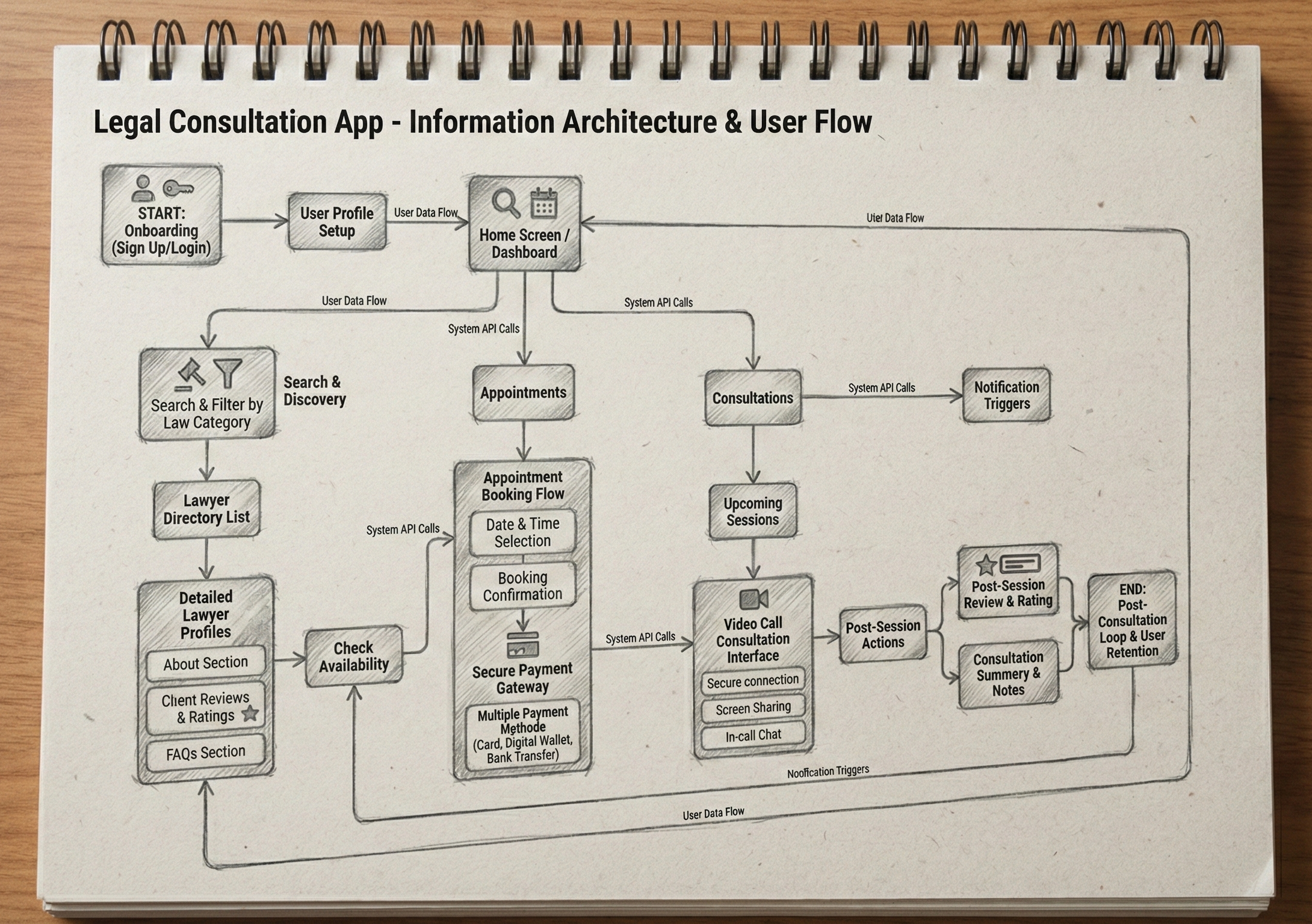
The goal of LegalEase was to design a mobile platform that removes the complexity and intimidation from finding legal help, making it as simple, transparent, and instant as booking any other service.
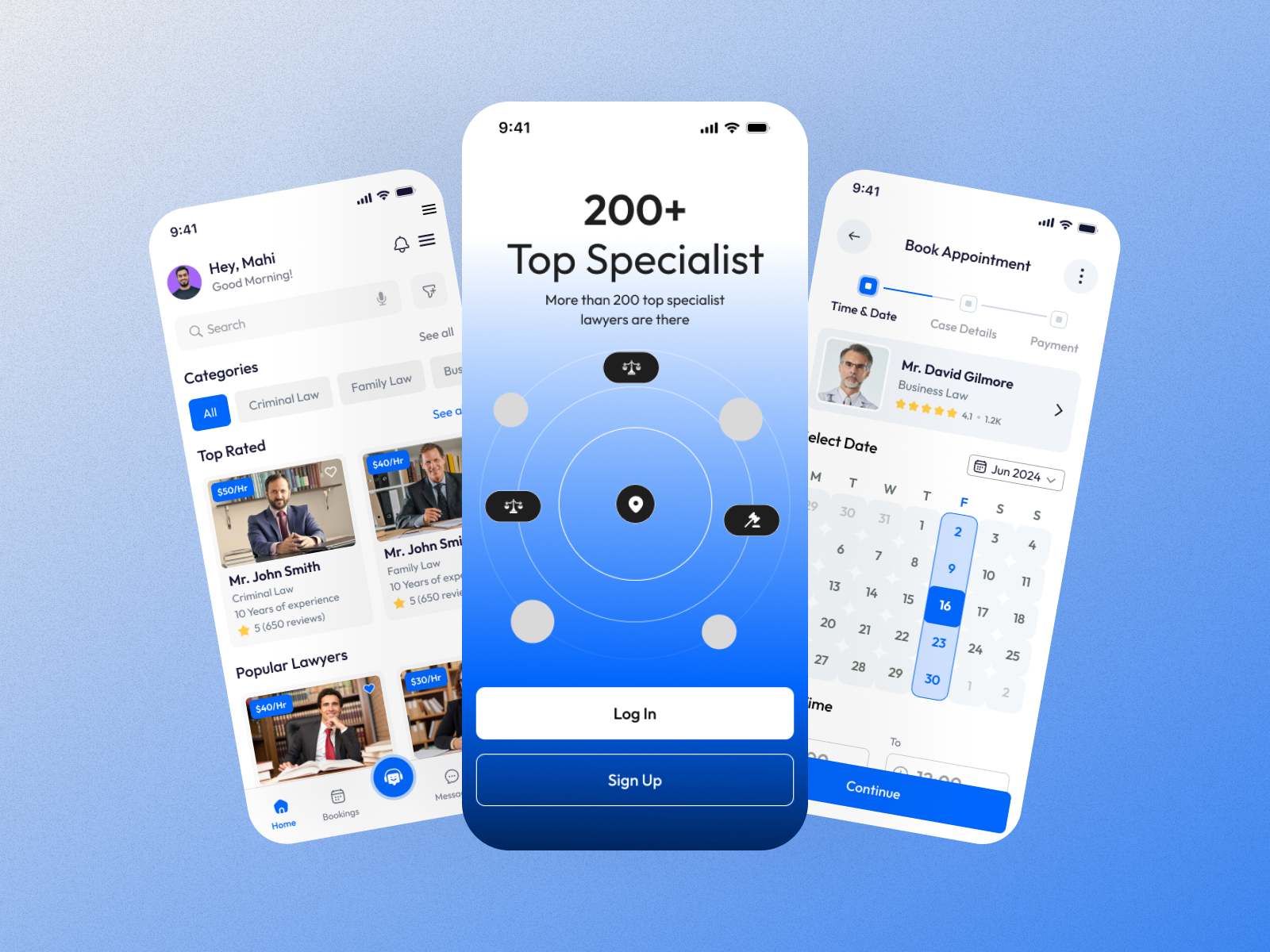
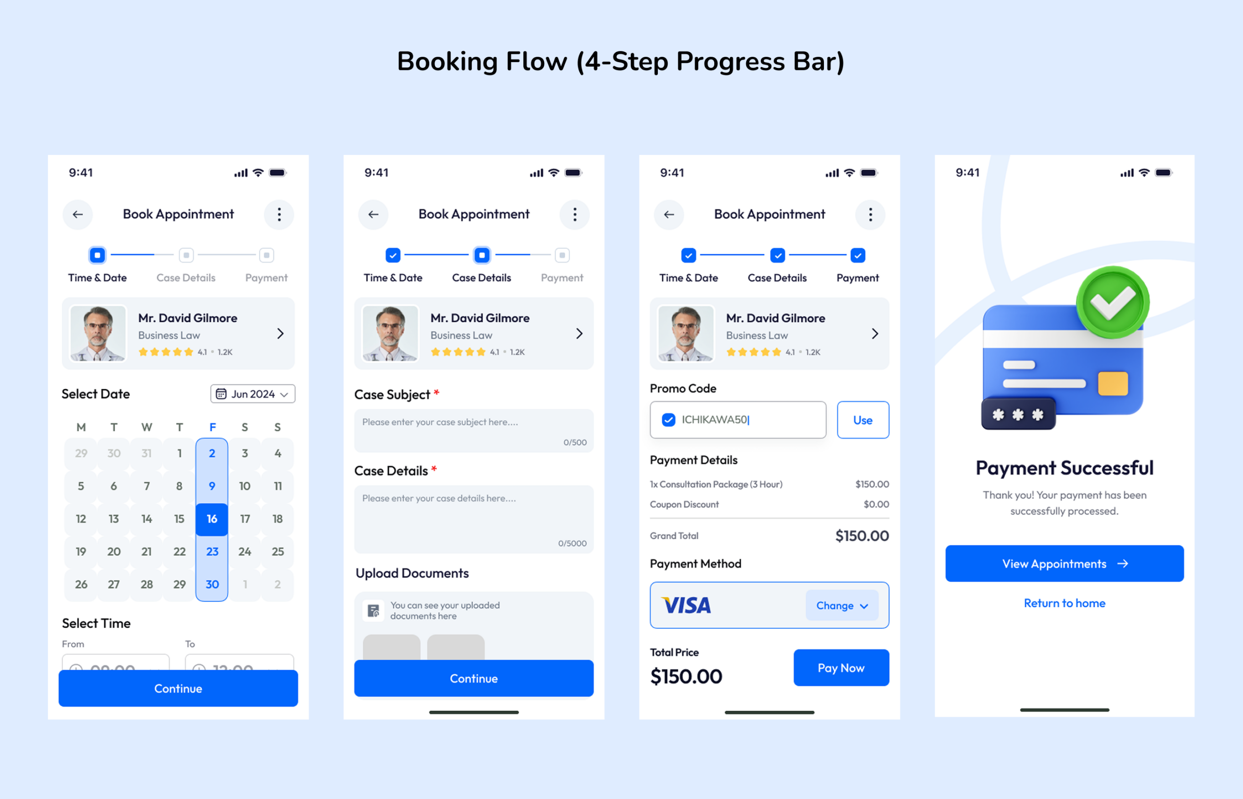
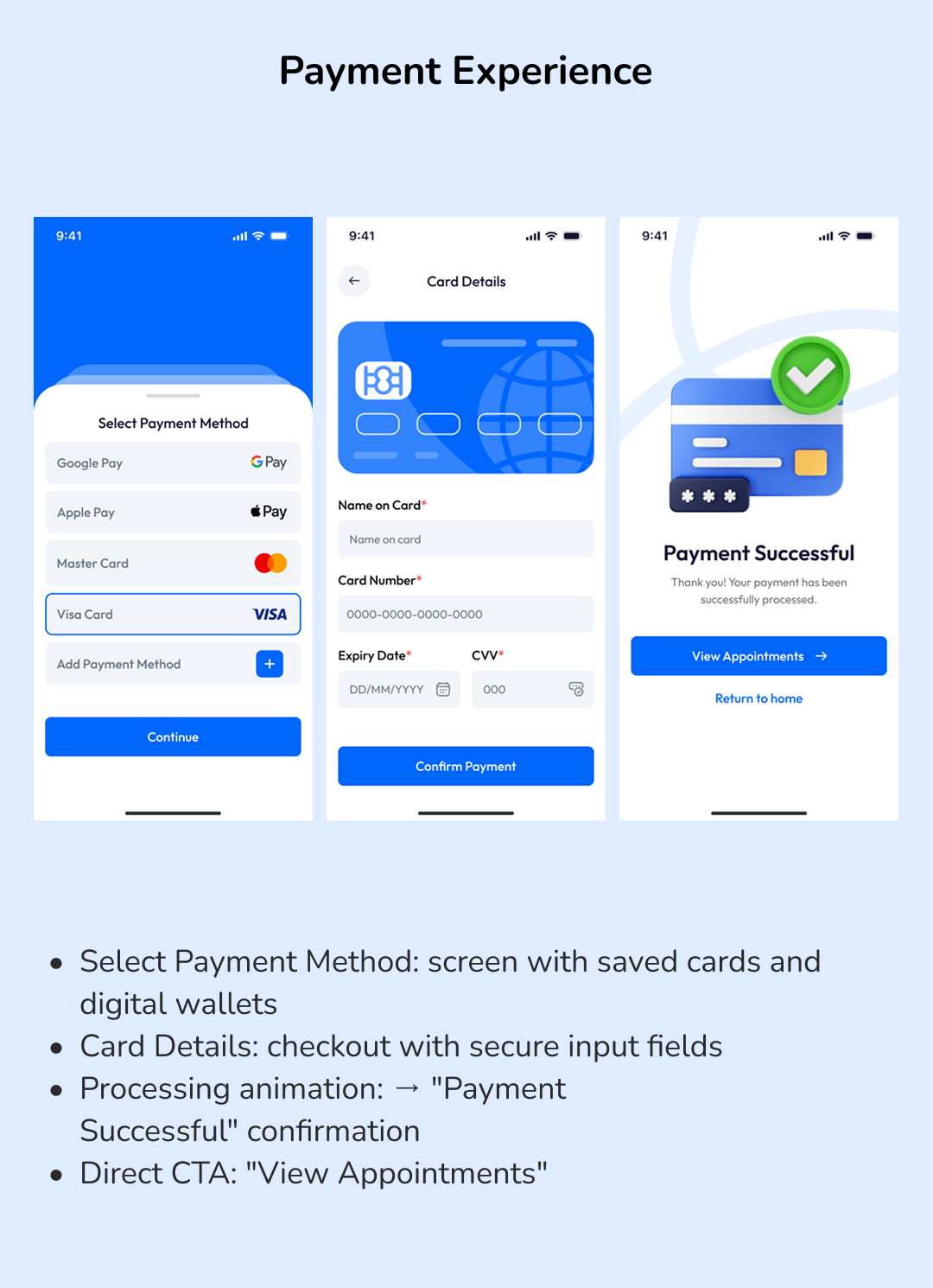
Payment summary showing consultation + platform fee = $150 total
——————————–
Projected Outcomes:
“Since this is a concept project, outcomes are based on design best-practice benchmarks and usability testing feedback.”
Metric
Projected Impact
Task Completion Rate
92% of test users completed booking in under 2 minutes
User Satisfaction
4.6/5 average rating from usability test participants
Booking Drop-Off
Reduced by ~40% compared to competitor flows (fewer steps, clearer pricing)
Trust Score
87% of users said the profile layout made them feel confident choosing a lawyer
————————————
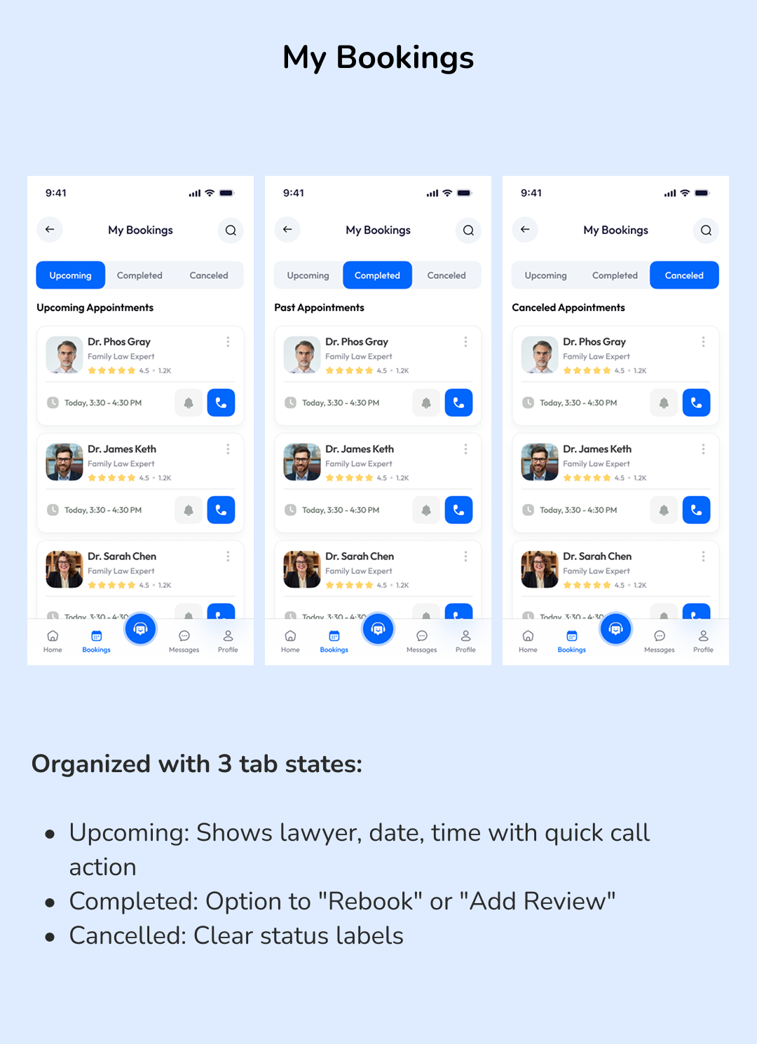
Key Takeaways:
Transparency builds trust: Showing fees, ratings, and reviews upfront removes the biggest barrier
Progress indicators reduce anxiety: The 4-step booking bar kept users oriented and confident
Simplicity wins: Every screen has one primary action, eliminating decision fatigue
End-to-end thinking matters: Designing from discovery → booking → payment → review creates a cohesive product experience
————————————
What This Project Demonstrates?
“My ability to take a real-world problem, conduct structured research, define a clear product strategy, and deliver a polished, production-ready mobile app design, end to end.”