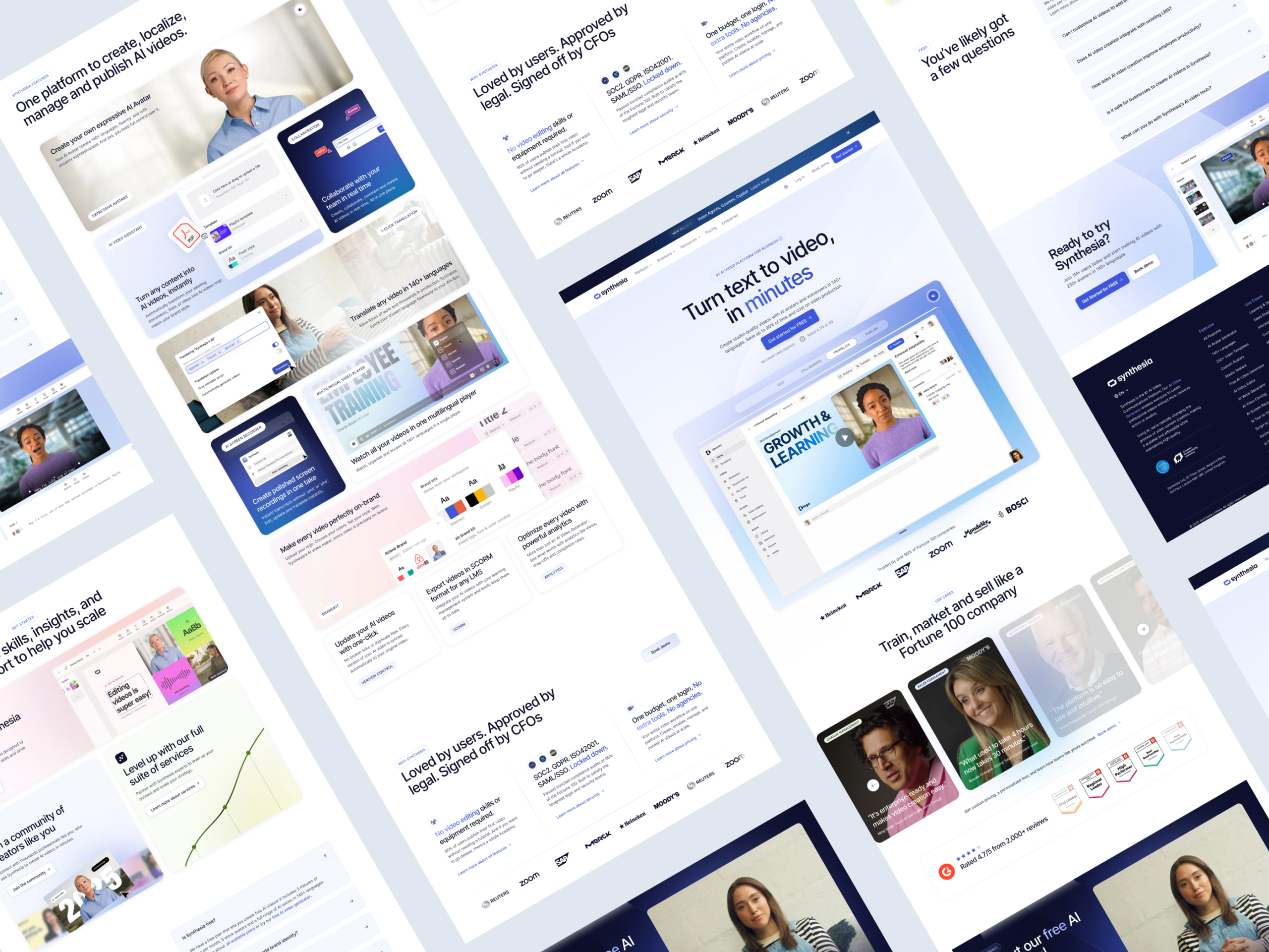
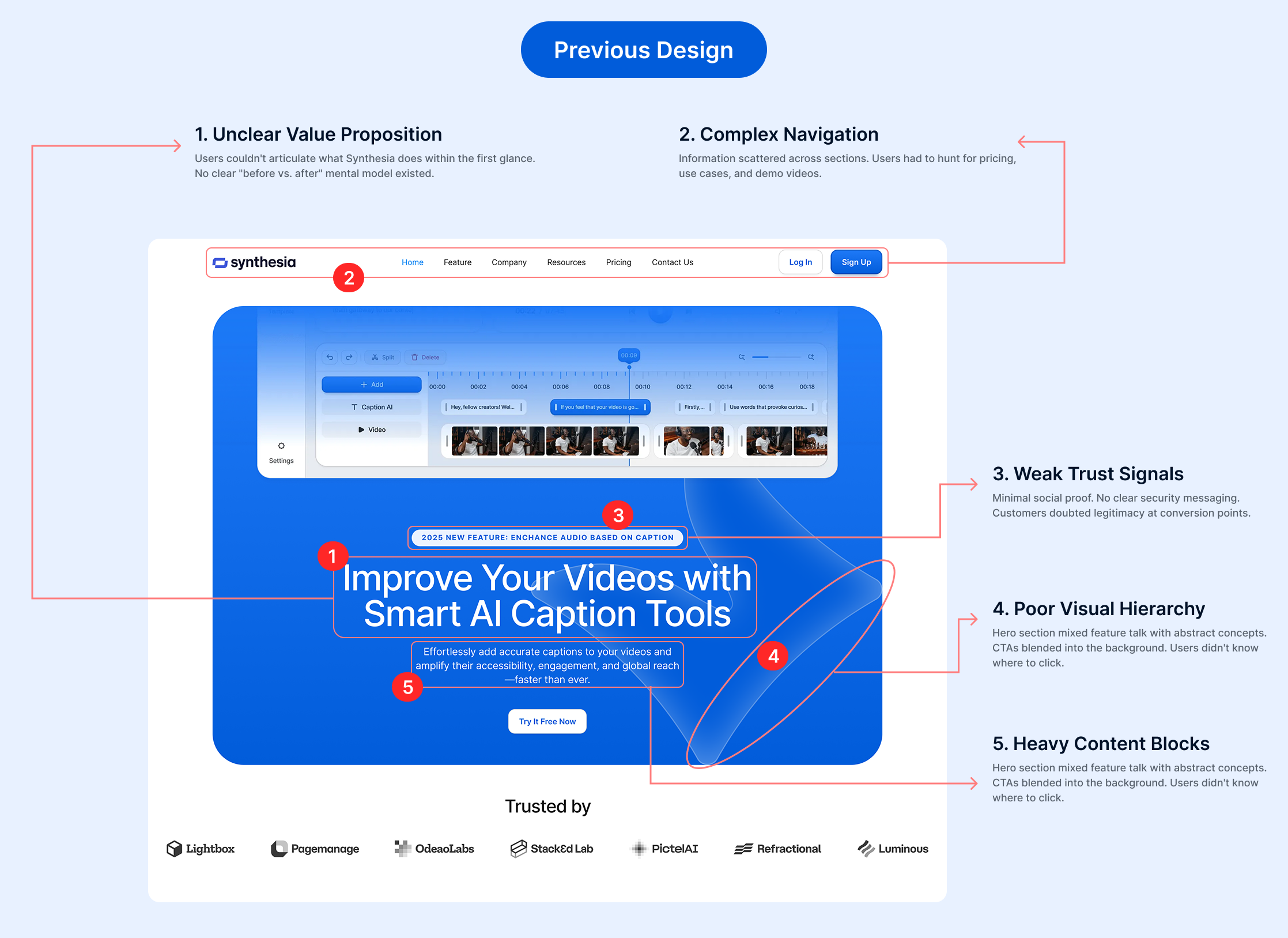
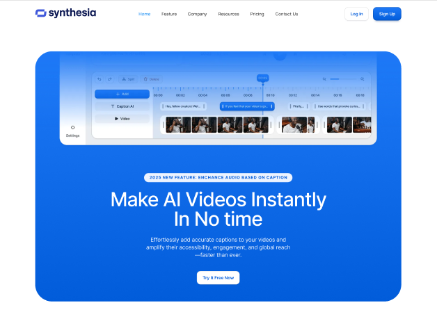
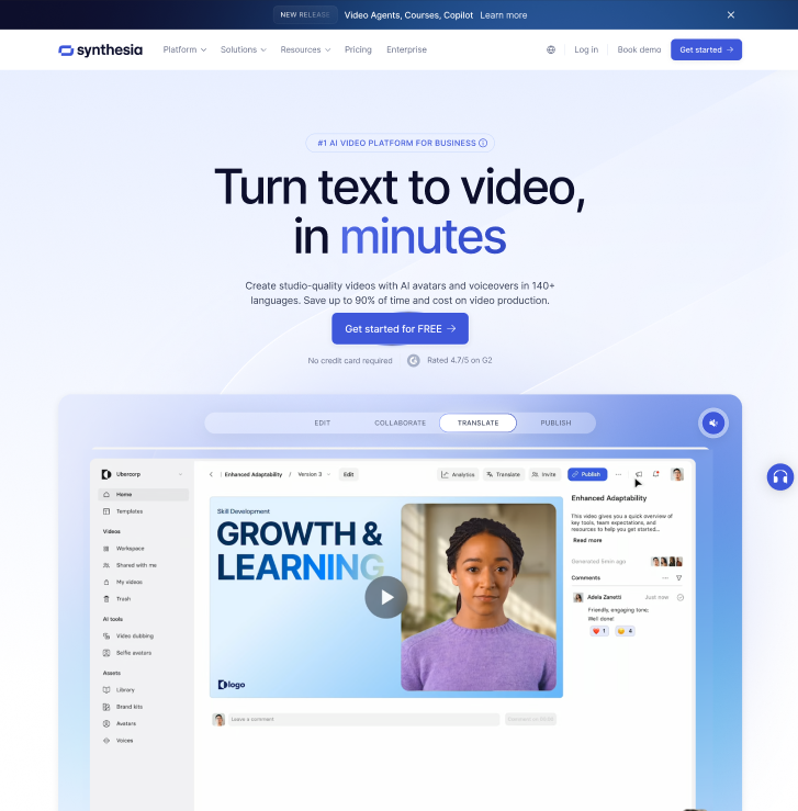
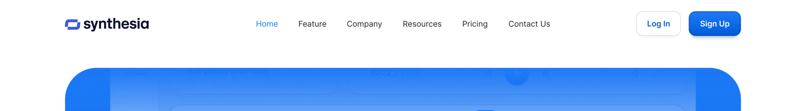
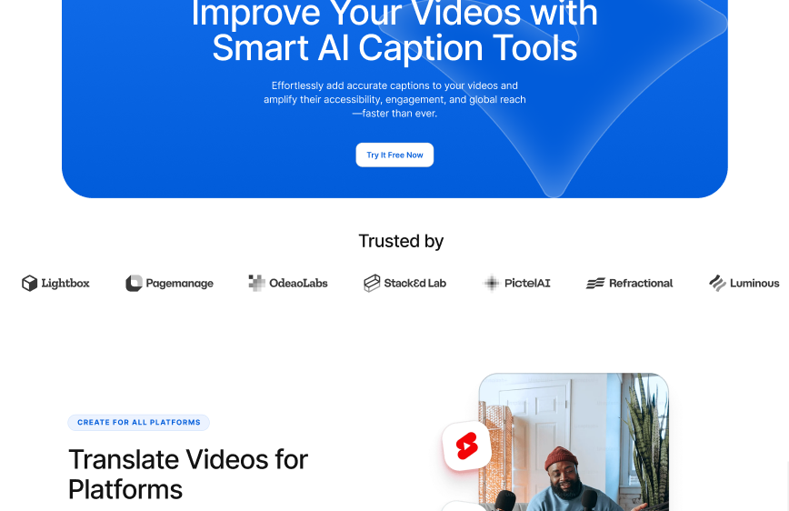
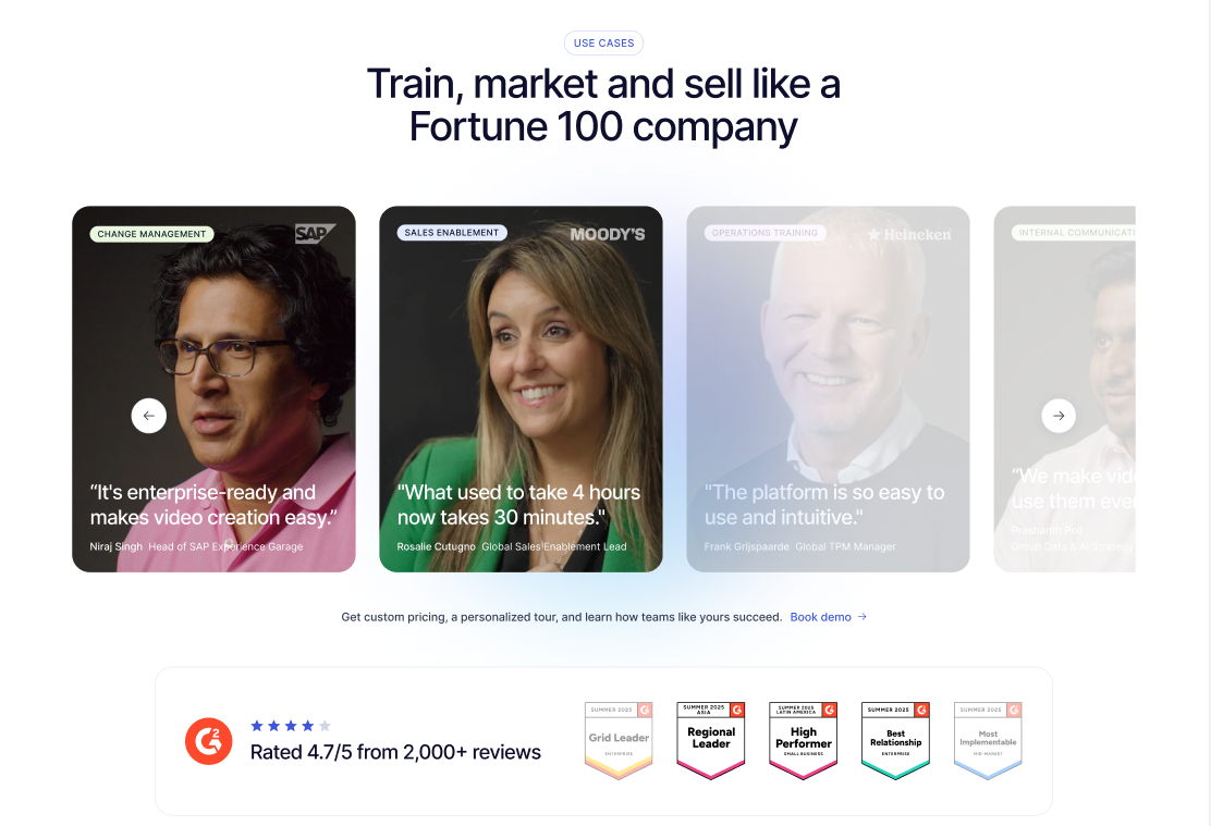
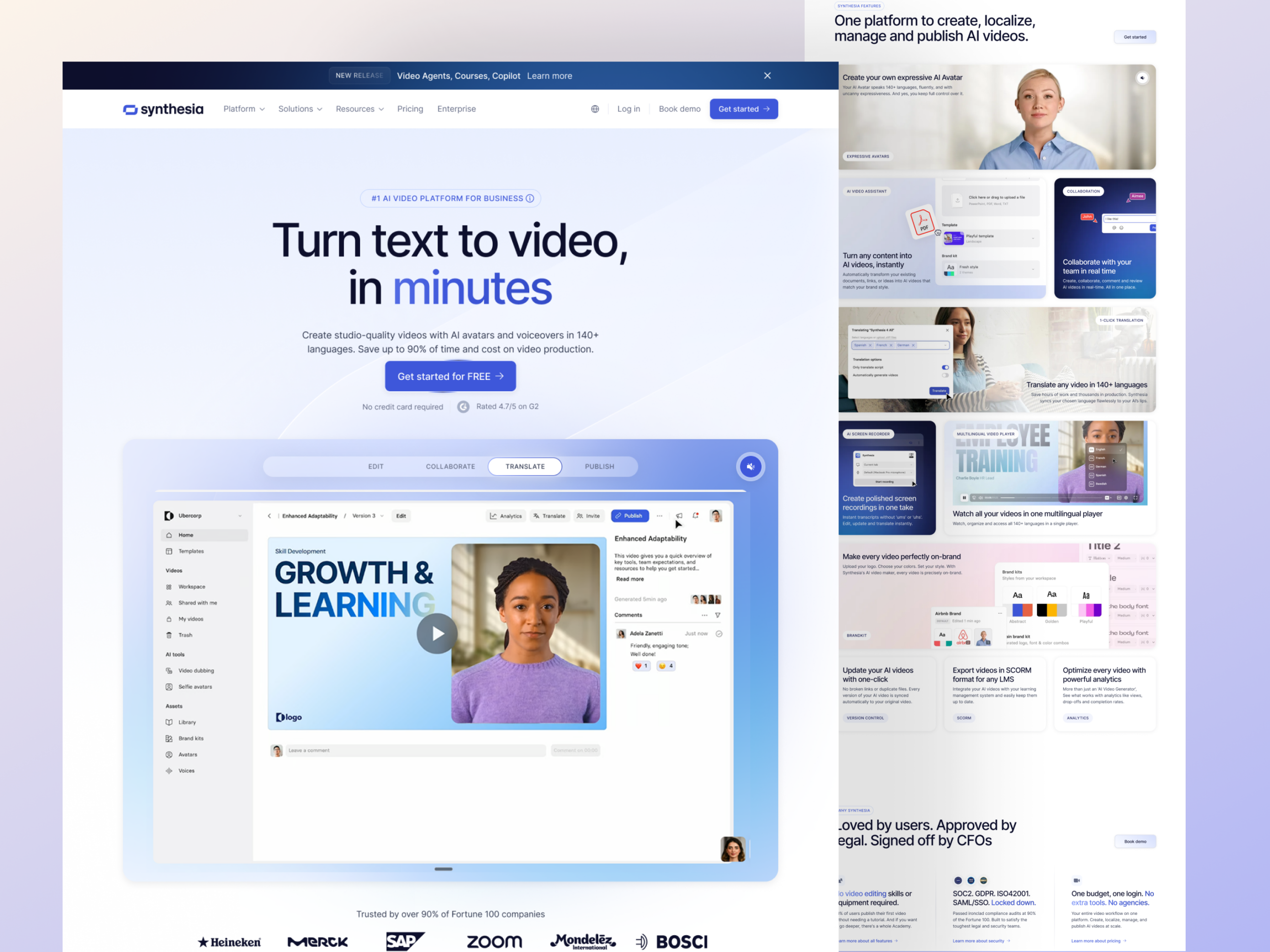
I identified conversion leaks and rebuilt the page around clarity, trust, and decision momentum. Timeframe 5 Weeks My Role I redesign SaaS websites by fixing clarity, trust signals, and decision friction. Project Goal This project focused on transforming a feature-heavy layout into a conversion-focused growth asset. View Site Services Branding Web Design Product Development Content Writing The ProblemUnclear value proposition. Hard to explain what the product does Feature-heavy hero instead of outcome-focusedWeak trust signalsVisual clutter. Competing CTAsRepetitive sections and broken hierarchy The HypothesisIf the messaging shifts from features → outcomes and the layout guides users step-by-step, then demo clicks and free trial starts should increase.————————————— 1. Hero SectionBefore: Abstract headline with generic tagline. No value clarity and small CTA button.After:Clear, benefit-driven headline: “Turn text to video, in minutes”Immediate visual proof (demo video or screenshot)Large, high-contrast CTA button at the topRisk reversal and supporting text (No credit card required, reviews)Subheadline answers “why now?” (“No filming. No editing. No AI learning curve.”) Before After 2. Navigation & Information ArchitectureBefore: Flat menu structure. Links to “Platform,” “Resources,” “Pricing” mixed with abstract pages. No clear entry points for different user segments.After:Sticky navigation bar with quick access to key sectionsSegmented CTAs: “For Marketers” / “For Content Creators” / “For Enterprises”Dedicated use case pages. Users self-segment immediately.Pricing + Demo + Signup positioned consistently across all pages Before After 3. Trust & Social ProofBefore: Single testimonial buried in middle of page. No logos. Vague security messaging.After:Fortune 500 logo carousel at top (visual credibility)3-5 video testimonials with customer name, role, companySecurity badges in footer + dedicated privacy pageStats displayed prominently: “Trusted by 500K+ creators” Before After 4. Guide the ScrollClear section sequencing:Problem → Solution → Proof → Features → CTA 5. The Redesign DecisionsBeforeAfter“#1 AI video platform” vague headline“Turn text to video in minutes” outcome-drivenAfterFeature clutter in herobeforeFocused primary CTA + supporting proofGeneric testimonialsContext-driven use cases with names + roles