
78% bounce rate (industry average is 41%)
12,000 monthly visitors
$100 average order value
Conversion rate of 0.8%
The Silent Revenue Killer
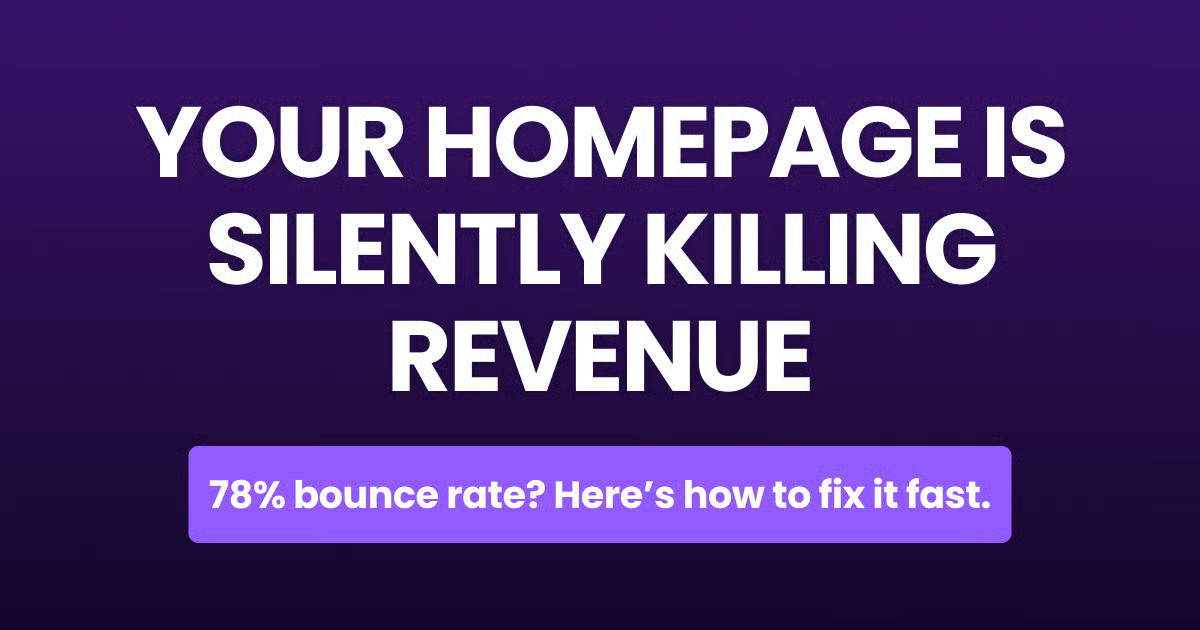
Let’s talk about the elephant in the room – your homepage bounce rate. You know, that number in Google Analytics that makes you want to close your laptop and take up farming instead.
Here’s what happened with my client:
Do the math – they were losing roughly 4,440 potential customers every month. That’s $444,000 in annual revenue just… vanishing.
Why Your Visitors Are Running Away
I spent 3 weeks analyzing 50+ ecommerce homepages. The pattern was clear as day – we’re still building websites like it’s 2010.
Your visitors aren’t lazy. They’re efficient. When they land on your homepage, they’re making a split-second decision: “Is this worth my time?”
The brutal truth? Most homepages fail this test spectacularly.
Common Symptoms of a Revenue-Killing Homepage
The “Wall of Noise” Syndrome Your hero section looks like Times Square – 15 different things competing for attention. Conversion rate impact: -23%
The “We’re Amazing” Monologue Your homepage reads like a corporate autobiography. Nobody cares about your company’s birthday. Bounce rate impact: +31%
The “Hunt for Value” Maze Making visitors scroll past 3 sections to find what they actually want. Time on page impact: -47%
The Fix: The 7-Second Clarity Framework
What It Is A homepage structure that answers three critical questions in the first 7 seconds:
What do you sell?
Who is it for?
Why should I care?

Why It Works
The human brain processes visual information 60,000 times faster than text. We’re leveraging this by creating a visual hierarchy that guides visitors to conversion, not confusion.
Implementation Guide:
The Hero Section Rewrite
Remove all secondary CTAs
Single headline focusing on customer outcome
Social proof above the fold (real numbers only)
The Value Stack
3 core benefits (not features)
Each benefit tied to a specific customer pain point
Visual hierarchy: biggest pain point first
The Proof Layer
Customer results above testimonials
Specific metrics over generic praise
Industry comparisons that matter
Real-World Case Study
The Setup Ecommerce brand selling premium coffee subscriptions. Homepage bounce rate: 72% Monthly revenue: $127,000
The Implementation
Stripped hero section to single message: “Barista-grade coffee, delivered weekly”
Added above-fold social proof: “17,853 subscribers, 4.8/5 average rating”
Restructured value proposition to focus on customer pain points
The Results
Bounce rate dropped to 43%
Time on page increased 2.1x
Monthly revenue jumped to $198,000

This Week’s Action Items
Today: Screenshot your current homepage hero section
This week: Audit against the 7-Second Framework
Next 30 days: A/B test your hero section using the framework
A Final Truth Bomb
Your homepage isn’t about you. It’s about your visitor’s journey from confusion to clarity. Every pixel should serve that purpose.
Next week, I’m diving into why your product pages are probably costing you more money than your last three vacations combined.
Keep optimizing,
Mahi
It’s meme time 😁
Visitors will bounce faster than a startup without runway.

Visitors will bounce faster than a startup without runway.